This is cool…
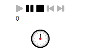
Last week I had the chance to do something I have not done before: build a Power BI report to be displayed on a big screen hanging on a wall. To make up for the loss of user interactivity, I used the new Drilldown Player custom visual to cycle through different selections and display a new slice of data every few seconds; Devin Knight’s blog post here has a great summary of how to use it. However I wasn’t happy about the look of the Drilldown Player visual in this particular report: the play/stop/pause buttons aren’t much use if you can’t click on them and the visual doesn’t show all of the values that it is cycling through. As a result I hid the visual behind another one and came up with a different way of displaying the currently-displayed selection.
Here’s a simple example of what I did. Imagine you…
View original post 271 more words
